


10 Golden Design Tips for PowerPoint Presentations
Learn how to create better slides with these top PowerPoint design tips.

.svg)


No matter how great of a presenter you are, the whole thing will fall flat without great slides. Discover 10 simple design tips for PowerPoint presentations that will take your presentations to a whole new level!
{{PRESENTATIONS_PORTFOLIO="/dev/components"}}
1. Show, don’t tell
Let’s start with the most obvious, yet vital design tips for PowerPoint presentations.
Graphs and charts are a business presentation design staple. However, you can also think about different design elements that can be both surprising and effective. For example, a simple illustration instead of a dull stock photo will delight your audience and keep them engaged.

2. One slide - one point
It goes without saying that before you start designing, you should refine the content and key messages of your presentation.
However, once you start putting everything together, it’s very easy to get sidetracked. If you’re explaining a particularly complex topic, it’s better to break it down into 2-3 slides than cram everything into one slide that’s impossible to navigate through.
3. Bullet points, not paragraphs
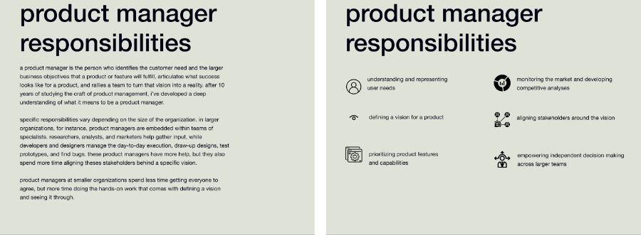
Keep your content specific and informative, but as concise as possible. Simplify your sentences, keep only the main point without writing an excessive amount of information on the slide. Below are two examples of a slide with the same information. Which one do you think is more readable?
4. Create visual hierarchy
As most slides have both images and text on them, you need to consider in what order you want the audience to take in information.
Use minimal visuals, such as icons or symbols if you want to keep the text the main focus of your slides. You can also utilize visual aids , such as arrows to guide viewers through the slide’s information.
On the other hand, if you want a visual asset to be the main focus of your slide (e.g. a chart or graph), make sure there are no large chunks of text drawing attention away from the visual message.
5. Use contrasting colors
Understanding a bit about color theory goes a long way. One of the simplest and most effective ways to get people’s attention is to add an accent color.
Just make sure the color contrasts fit your overall color scheme - otherwise the slides might look ugly or harm your brand image.

6. Pick legible fonts
If you don’t have a brand guide to tell you what fonts are typically used for brand communication, a rule of thumb is to opt for minimalist sans serif fonts. These generally tend to be more legible and give off a professional vibe.
Add more visual interest by combining different typefaces from the same font family. This way you’ll keep things dynamic without compromising on visual consistency.
7. Utilize white space
White space is commonly talked about in the context of web design. And yet, it’s one of the most important design principles that helps viewers notice and take in the most vital information.
The same goes for slide design - don’t crowd your slides with too many elements. Leave some breathing to ensure the important stuff doesn’t go unnoticed.
8. Don’t overdo it with animations
This is definitely one of the most useful design tips for PowerPoint presentations. While it may seem fun, too many animation styles will make your slides seem like a school presentation, and ward off potential clients, partners or investors.
A much better and more creative way to use animation in your slides are custom motion graphics that can add visual interest or draw attention to the vital points.
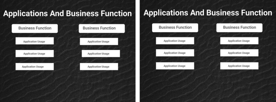
9. Align and position
Inconsistent text, logos, and design elements jumping from slide to slide can make a presentation look unprofessional and rushed, often distracting the audience.
To maintain a polished look, always align and position elements properly using alignment tools available in most presentation software and presentation templates.
10. Stay consistent
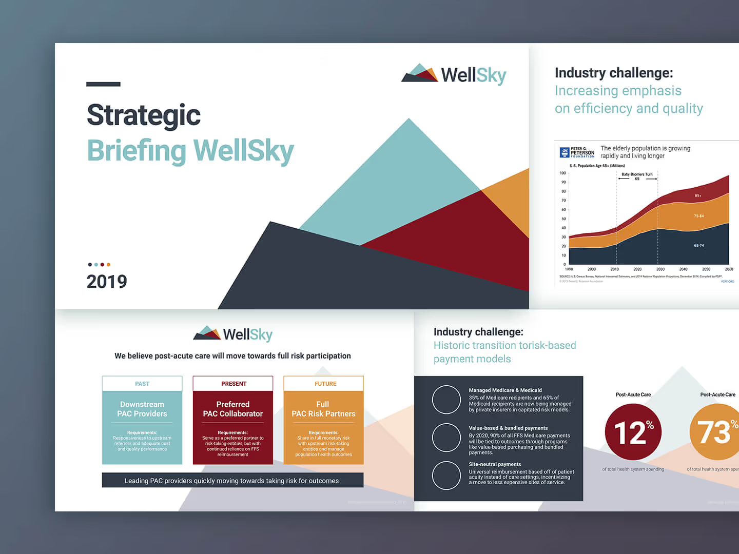
From your title slide, to slides with charts and graphs, animations, or just text - it’s important to keep the color scheme and design elements consistent. The example below shows this presentation design tip in practice - as you can see each slide has a different layout, but they all maintain the same theme.

Conclusion
We hope you’ve found these PowerPoint design tips helpful. However, no amount of handy presentation design tips can replace the work of a professional presentation designer.
If you’re looking to get a fast and affordable solution for your presentation design needs, look no further than ManyPixels!
With our flat monthly rates you can get all high-quality slides and any other brand assets needed to take your business to the next level.
{{PRESENTAION_BANNER="/dev/components"}}
Get started today or schedule a demo to learn more.

Learn how to create better slides with these top PowerPoint design tips.
A design solution you will love
Fast & Reliable
Fixed Monthly Rate
Flexible & Scalable
Pro Designers

.jpg)
.jpg)
